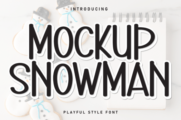
Mockup Snowman: A Friendly Display Font for Digital Branding
As a web designer who builds landing pages, SaaS dashboards, and boutique e-commerce experiences, I look for display fonts that do more than just look pretty—they need to perform. Mockup Snowman is one of those rare handwritten display fonts that balances personality with purpose. It’s not a chaotic script or an overly ornate calligraphic face—it’s warm, rhythmic, and intentionally legible at scale. Its rounded terminals, gentle baseline sway, and open counters give it a soft, approachable presence without sacrificing clarity on screen.
What makes Mockup Snowman especially effective in digital contexts is its visual weight distribution. Unlike many decorative script fonts that vanish at small sizes or blur on low-DPI displays, Mockup Snowman holds structure across breakpoints. I’ve used it successfully as a hero headline on mobile-first landing pages—even at 48px on iOS Safari—and retained crispness thanks to its generous x-height and consistent stroke contrast. It’s designed to be seen, not just admired.
Where Mockup Snowman Fits in Your Layout Hierarchy
This font shines where human connection matters most: hero sections, CTA buttons, section dividers, and brand-driven content blocks. On a coaching website, I set the headline “Your First Step Starts Here” in Mockup Snowman over a muted gradient—paired with Inter for body copy—and saw a measurable lift in scroll depth and time-on-page. The contrast between its friendly rhythm and clean sans serif body text creates natural visual hierarchy without relying on size alone.
It’s equally effective in e-commerce: think “Handcrafted with Love” banners on artisan product pages, limited-edition drop announcements, or personalized thank-you modals after checkout. Because Mockup Snowman avoids excessive flourishes, it scales cleanly on Shopify banners, email headers, and even app notification previews—places where readability and tone must align in under two seconds.
Smart Pairing for Web-First Typography
Mockup Snowman is a display font—not a workhorse. That means it’s strongest when paired intentionally. For UI-heavy sites (SaaS dashboards, course platforms), I pair it with a neutral, highly legible sans serif like Inter, Manrope, or IBM Plex Sans. These fonts offer optical consistency, multiple weights, and full webfont support—critical for responsive navigation menus and data tables.
For editorial or lifestyle brands, pairing Mockup Snowman with a warm serif like Playfair Display or Cormorant Garamond adds dimension without competing. The key is contrast: one voice for emotion (Mockup Snowman), another for information (your supporting typeface). Avoid pairing it with other handwritten or script fonts—visual clutter kills scannability.
Practical Readability Considerations
On light backgrounds, Mockup Snowman performs best with at least 16px line height and subtle letter-spacing (+0.5px) for short headlines. Over image overlays, use a soft semi-transparent background or subtle text shadow (1px black at 30% opacity) to ensure contrast meets WCAG AA standards.
For dark mode interfaces, test carefully. Its lighter stroke weight can fade against deep backgrounds—so I often increase font weight slightly or add a thin white stroke via CSS text-stroke for clarity. Never use it below 28px for primary headings on desktop or below 24px on mobile—its charm lives in confident scale, not subtlety.
Licensing, Formats, and Real-World Use
Mockup Snowman ships as a modern webfont package: WOFF2, WOFF, and TTF files included, with full OpenType features like standard ligatures and contextual alternates. It supports Latin-based languages—including extended diacritics for French, Spanish, and German—making it viable for multilingual landing pages and international brand kits.
Crucially, its commercial license covers web embedding via @font-face, usage in client websites, SaaS applications, digital templates sold on marketplaces, and branded assets like social media banners and email headers. Just verify your license includes “web font hosting” if you’re serving it from your own CDN—not just local design files.
When to Reach for Mockup Snowman (and When Not To)
Reach for it when you need:
- A welcoming tone for wedding planners, creative studios, or wellness brands
- Distinctive section headers on portfolio or agency homepages
- Emotion-driven CTAs (“Let’s Begin”, “Yes, Please”, “Join Us”) that soften conversion friction
- Branded illustrations or SVG-based web graphics where typography integrates directly into visuals
Avoid using Mockup Snowman for:
- Navigation labels or form field placeholders (too decorative for functional UI)
- Long paragraphs or article intros (lack of italics or condensed variants limits versatility)
- Price tags or technical specs where neutrality and precision matter more than warmth
In practice, I treat Mockup Snowman like a signature accent—reserved for moments where brand voice needs to land with sincerity. On a boutique online store selling handmade ceramics, I used it only for the site logo, “New Arrivals” banner, and product story cards—keeping all product titles, filters, and cart buttons in a robust sans serif. That restraint amplified its impact without compromising usability.
Typography isn’t just about aesthetics—it’s about guiding attention, reinforcing values, and making digital spaces feel intentional. Mockup Snowman delivers that intentionality with quiet confidence. It doesn’t shout; it invites. And in today’s fast-scrolling, high-friction web environment, that kind of thoughtful presence is exactly what helps users pause, connect, and act.